How to choose your paint colour
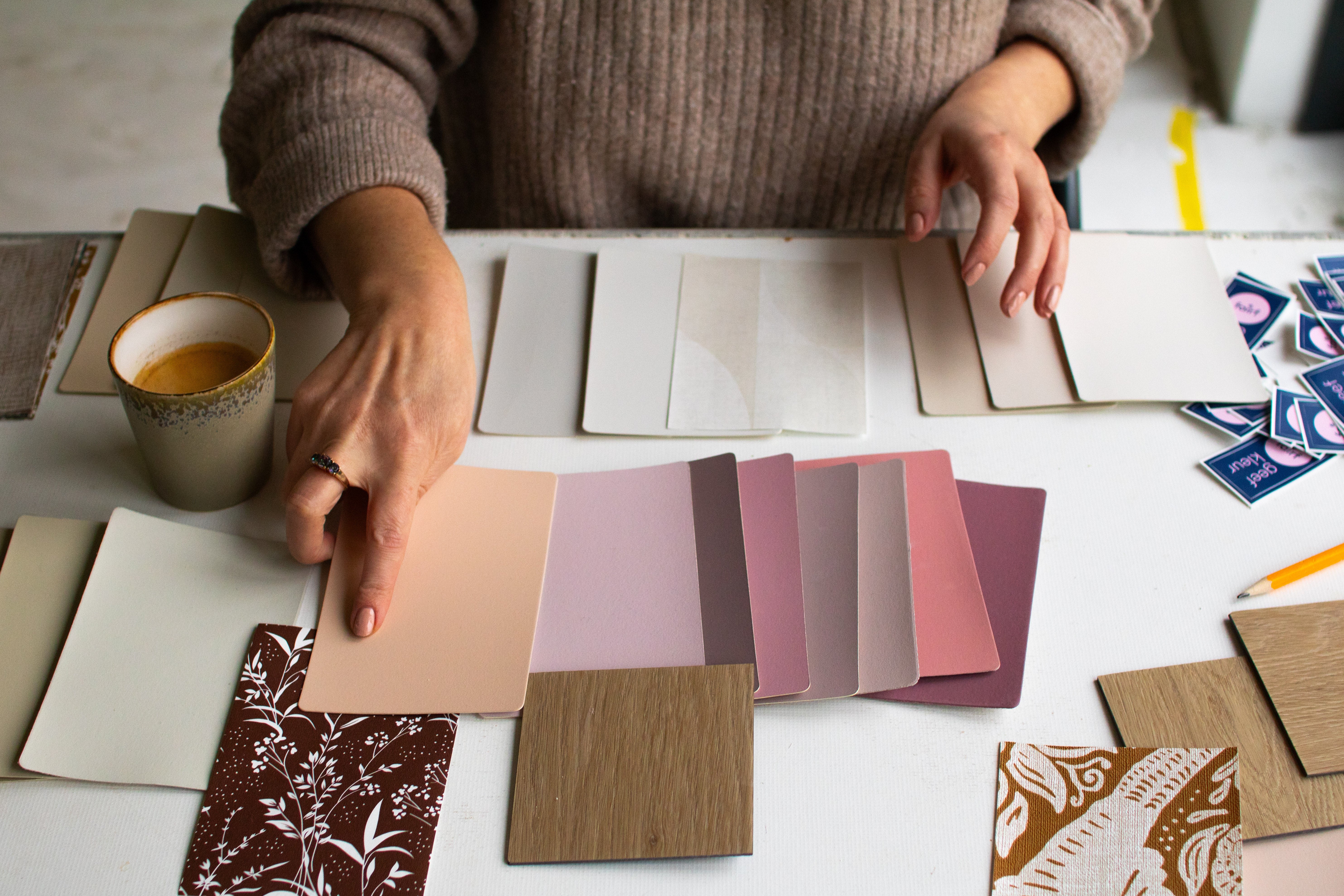
determining colour; how do you choose the right fairf colour?
Choosing a colour can be quite tricky. How do you prevent the result from turning out very differently than you had in mind? In this blog, we explain why you shouldn't just blindly copy a colour from Pinterest and we give you 3 tips on what to look out for when choosing a colour.The perfect picture
Pinterest and Instagram offer a lot of inspiration. It’s lovely to scour all those interior design photos looking for the perfect style for your home. But an image on social media may look great, that doesn't mean it will look the same in your house. The most important elements that cause this are: screen, photo, light, and interior combinations.
- Screen: to properly judge a colour from a screen, it needs to be calibrated, and most screens aren't.
- Photo: the image on social media is a photograph. This image has likely been heavily Photoshopped to achieve a perfect look. Think about lighting and post-processing.
- Light: the room in the photo probably has different lighting than your home. Light from the north feels very different than light from the south, and artificial light makes everything look different again.
- Interior combinations: do you have the same floor as in the picture? The chances are high that you don't, while the floor has a huge influence on your colour perception. Also, completely different furniture and accessories can make the image from the screen evoke a very different feeling for you.
Determining the most beautiful fairf colour
Okay, now it’s clear how you should not determine a colour, but how do you do it properly? We are happy to help you with that. Here are 3 tips that will help you choose the best fairf colour. This is how you determine colour:
- Choose using fairf swatches. Because it is almost impossible to choose the right colour on a screen, we have created colour folders with real paint swatches. These colour folders can be ordered via our website. Is the swatch from the colour folder still too small to really make a decision? Then order a larger colour sample in A6 format.
- Pay attention to lighting. The advantage of this larger colour sample is that you can easily hold it against the wall. Definitely move it around to different spots, for example in a dark corner and where the light hits the wall. This way you know for sure that you really like the colour. And also take a look in the evening with artificial light to see if you still like the colour then. So, determine colour in both daylight and artificial light for the complete picture.
- Match floor and wall. In addition to lighting, the floor is also very decisive for the colour on the wall. It has a major influence on how you experience a colour. For instance, a gray wall with a wooden floor can form a warm whole. While if you combine the same gray colour with an anthracite tile floor, the whole can be experienced as cool. Quite a difference, therefore. So you cannot view the colour separately from the rest of your interior.
One last tip: colour is something personal. So don't ask too many people for their opinion. It is good to look with a few people at which colour fits best in your interior. If you ask 10 people, you get 10 opinions, and that doesn't make choosing any easier. Follow your gut. And if it really doesn't turn out the way you want, you just paint over it again with a different colour. No harm done. So determine your colour and start painting!