The colour of 2024: Apricot
The colour of 2024:
Apricot
Colour authority and trend forecaster WGSN, as well as Pantone, predict that peach will be the colour of 2024. The colour represents infatuation, and it is a colour that works to be 'restorative, refreshing, and energetic.' According to the experts, the warm colour will embody the atmosphere of the coming year. And we can certainly get behind that. After all, it looks pretty great too!
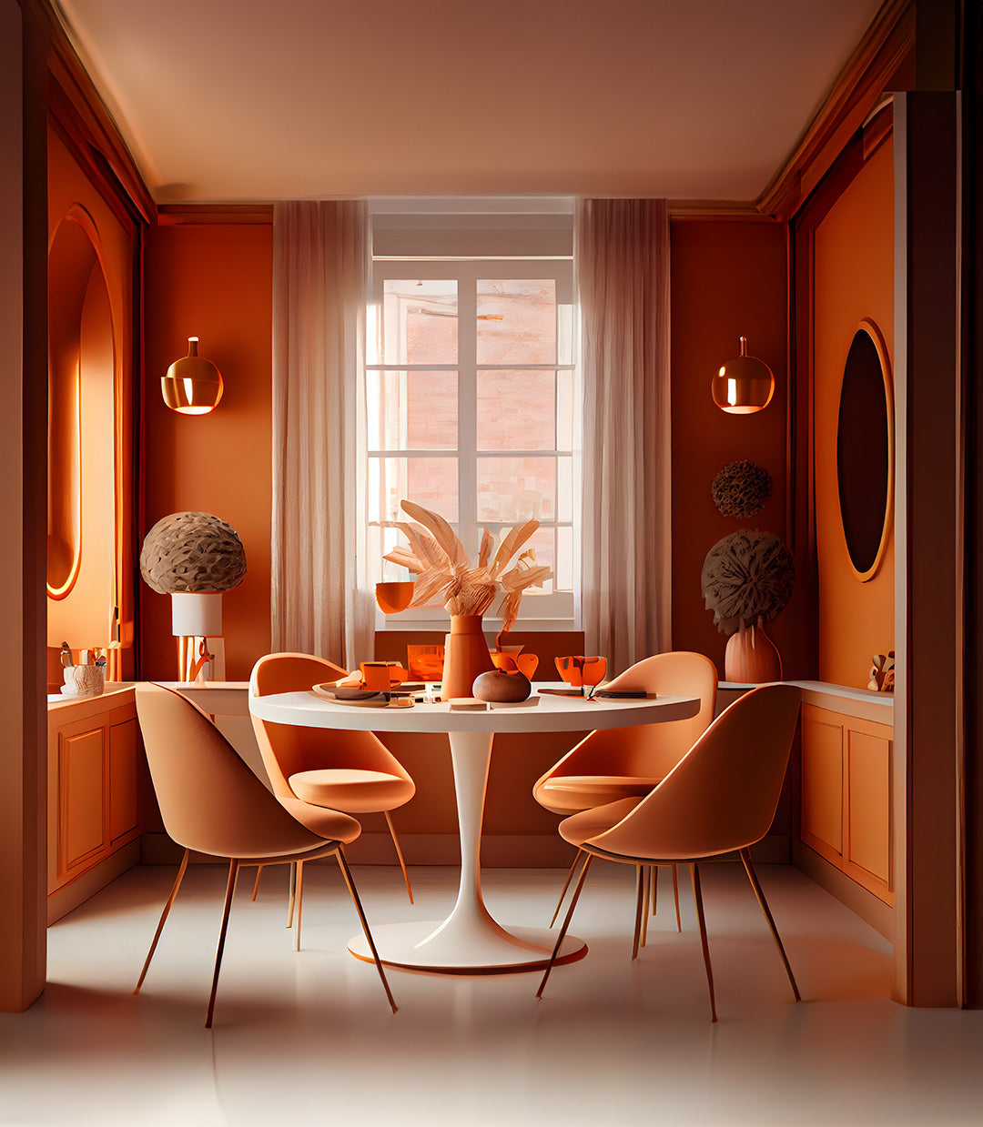
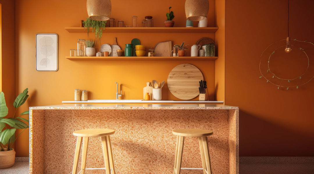
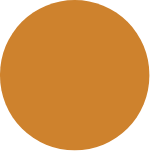
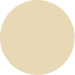
Look, if you're going to apply apricot, you've got guts. We love that at fairf. Our colours Pim and Diede are perfect orange shades, but 'Apricot Crush' by WGSN or 'Peach Fuzz' by Pantone can also be mixed by us exactly. There's nothing wrong with 9010, of course. Don't get us wrong! But Pim and Diede, that's the bolder work. Anyway, enough about Pim and Diede. What can you actually do with it? With that soft orange? A few ideas:
Apricot Crush in your kitchen
When we think of orange, we think of soccer and King's Day, but what immediately follows: oranges, peaches, apricots, tangerines. Delicious fruit that makes you happy. Bridge: you usually keep fruit in a nice bowl in your kitchen. And that is therefore the first place where we would smear Pim or Diede on the walls! Think of the combination with a light-tinted terrazzo countertop and you're on vacation every day!
Apricot crush in your bedroom
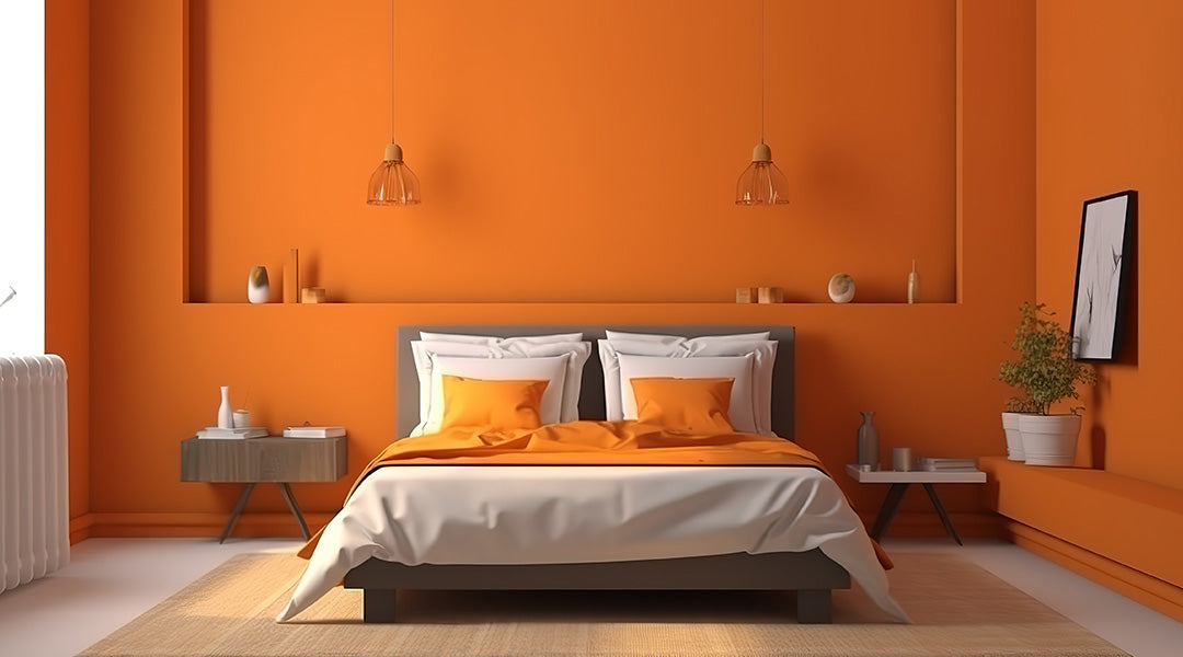
We’ve seen thousands of terracotta bedroom walls pass by over the past few years. Cool! But if you are looking for something a little sweeter, just a bit softer (and that’s perfectly okay in the bedroom), then the orange we are talking about here is a very nice alternative: warm, soft, and according to WGSN, it also ensures restoration, refreshment, and new energy. And isn't that exactly what you want to be able to say after a good night's sleep, that you feel restored and refreshed and that you are starting a nice day with new energy? Oh yes, that is exactly what you want to be able to say. Pim or Diede already in your shopping cart? We get it!
Apricot crush in combination with green
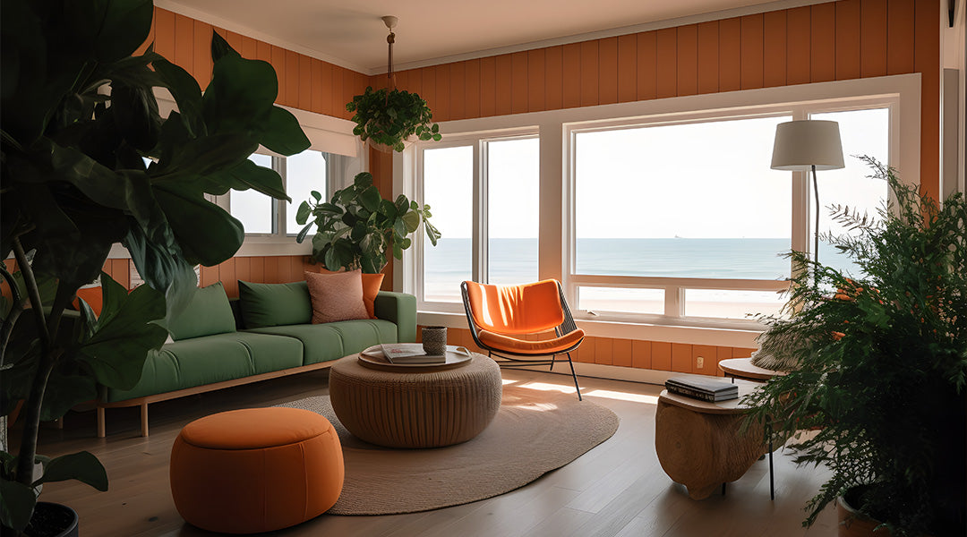
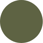
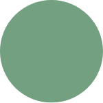
This last tip doesn't have as much to do with the room where you apply an apricot crush shade, but it does have to do with the bold colour combination you can make with it, because we believe that apricot in the mix with a dusty palm leaf green can be very beautiful. In our fairf colour collection, that green colour is called Rutger. And Rutger? It brings character into your home. Just take our word for it. We ourselves think Rutger and Diede are the best combo, because when you combine these two colours, that surf/beach house feeling quickly arises. Can you already feel the refreshing new energy blowing into your living room? We get it. That apricot crush isn't so crazy after all.
Then read our blog about fashion trends